Final compositions

The assignment due this week was our final versions of our Gestalt pieces, mounted together on a black board. I made a few changes to my pieces before finalization, some drastic, some minor. To arrange the pieces on the mounting board, I tried to create a balance between the heaviness of the designs. Tension, because it has the most white space, I put in the middle. To either side of it I placed order and comfort, which have less white space but are both very structured and confined to about the middle of the page. At either end I placed congestion and playfulness, which were the heaviest of all of the designs.
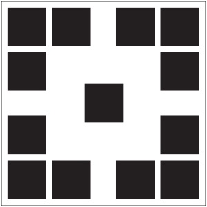
a1-final


ORDER

Order

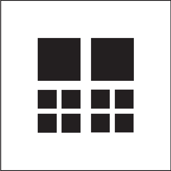
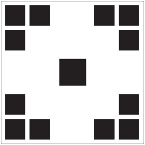
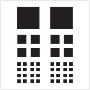
When receiving feedback from Somya on my pieces, for many of my pieces she challenged me to use fewer squares. I put this into practice in my order composition by removing the bottom group of squares, and I think it turned out very well. I took issue all along by the way the smallest squares seemed too close together, and I think the composition looks better without them. The new composition forms a square, which adds another dimension of order with the way it fits into the containing white box itself.
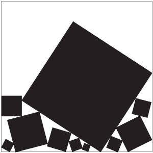
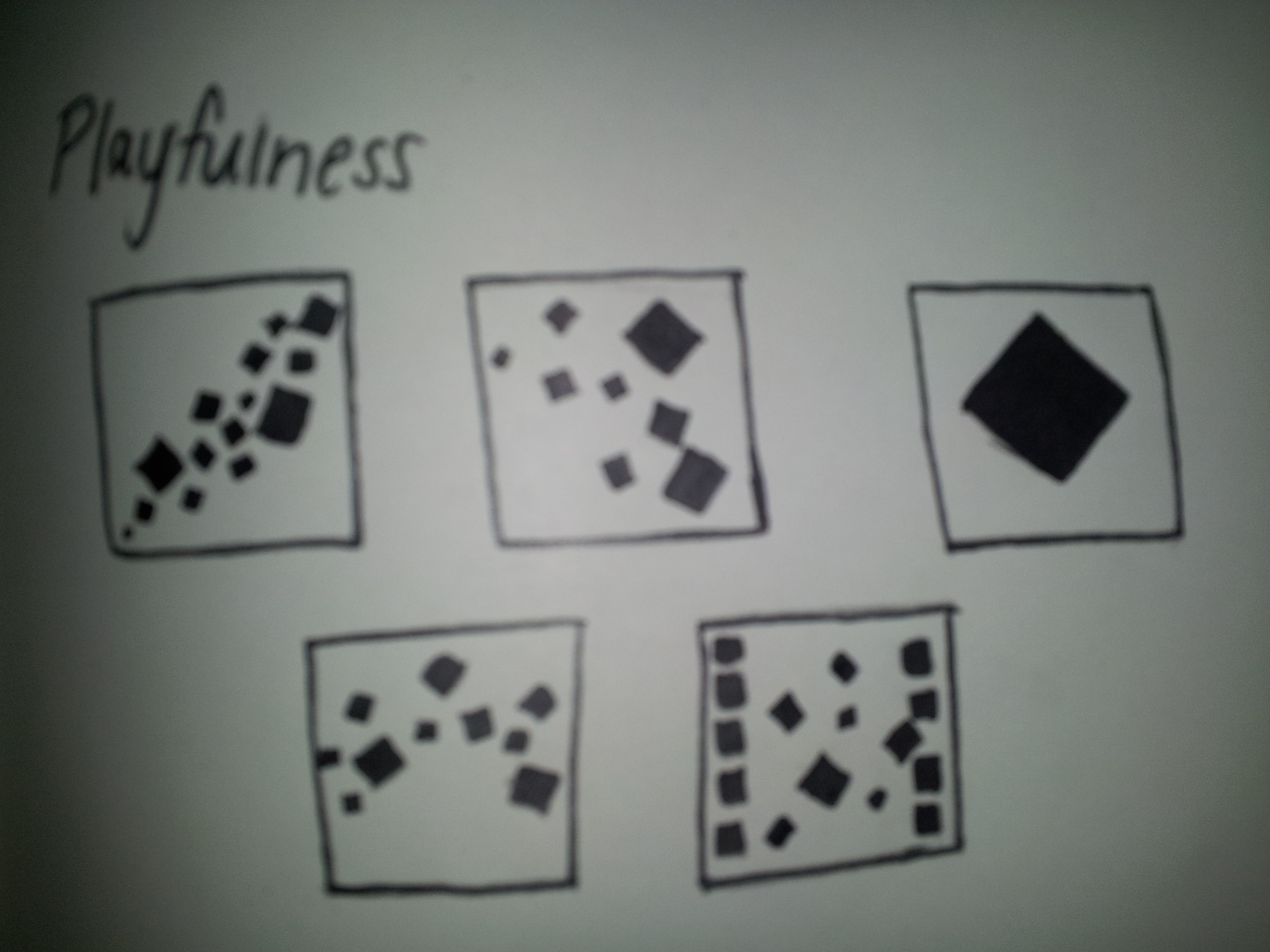


PLAYFULNESS

Playfulness
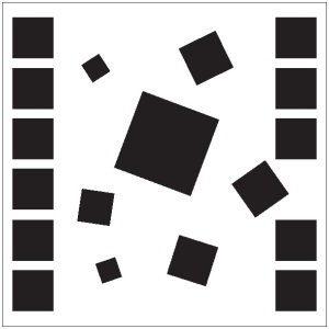
For the most part, this design remained unchanged from the previous version. I removed only one square. Again, Somya challenged me to use fewer squares, but I found that whenever I attempted to manipulate the design, I lost the feeling of playfulness to a large extent. I tried several variations using fewer squares, but was unable to find one which I felt exemplified playfulness as much as this composition.


COMFORT

Comfort

With this design I made one of my most drastic changes. Throughout the design process, I struggled to have my composition display comfort. Somya commented that in my prior versions of the design, the eye jumps between the figure and the ground. To change this, I kept some elements of my original design, but manipulated them in a way so as to change them into something new. In this design, which I think is more comfortable to view, I created the idea of smaller blocks cradling a larger one.
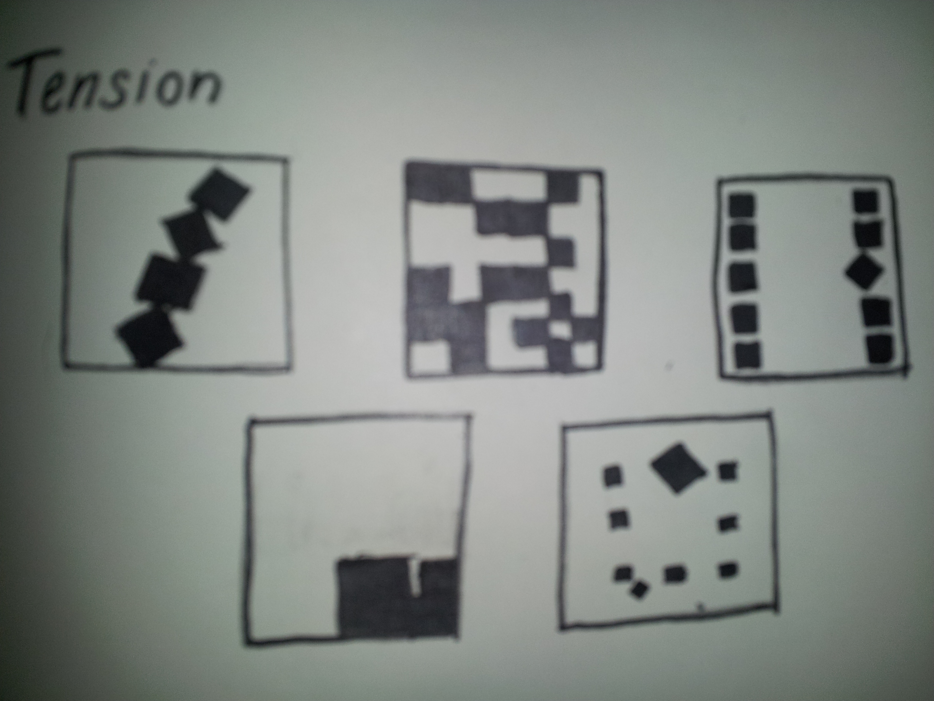

TENSION

TensionWith this design, I took Somya’s advice of trying to display the same thing with less squares. In addition, I tried again to fix the problem I had been having that, due to the extreme angles of the blocks, the design tended to evoke playfulness rather than tension. With this design, I kept the same idea, but leveled out the bottom block, and created a distance between it and the top block, which looks as though it is about to fall on the bottom block. The angle of this block creates an uncertainty in the design about where the motion is going to go next, creating tension.
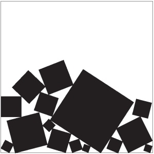
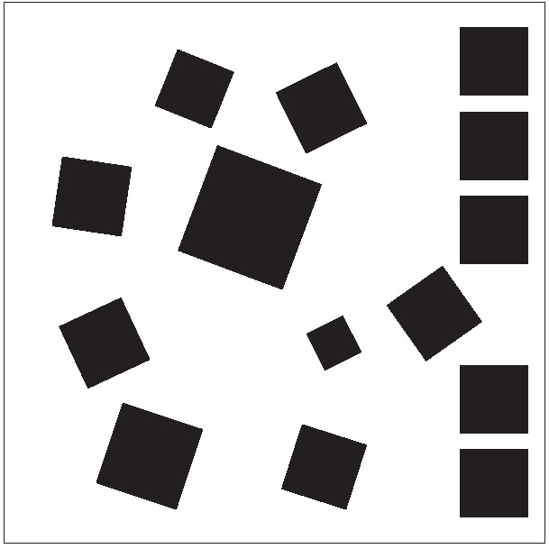

CONGESTION

Congestion

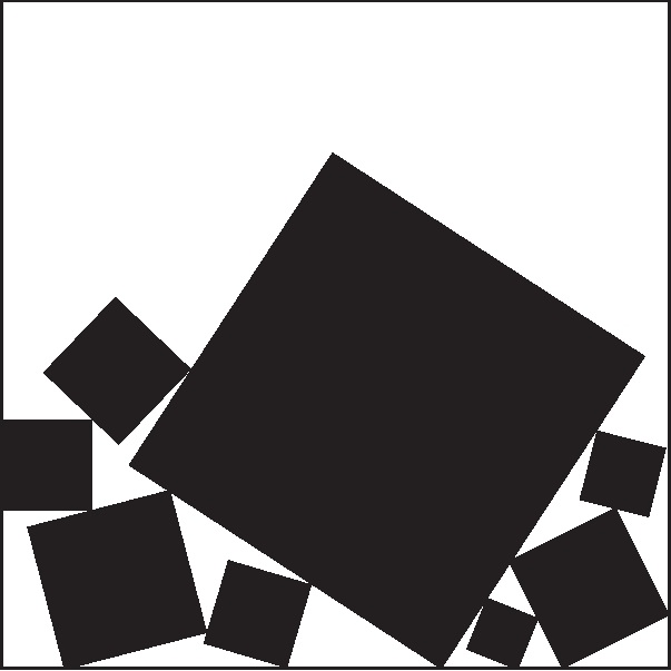
I made very minor changes to this design. I removed many of the smaller blocks, which I found reduced the clutter of the design without confusing or decreasing the value of the emotion conveyed. In addition, I increased the size of the larger block to about the same size as it was in my original design. I find that this contrast, along with the contrast of the clutter in the bottom with the white space at the top of the design, conveys congestion very well.

Critique compositions

During class on Tuesday, Jan 29, every member of the class participated in a group critique, where we were given the chance to evaluate others’ work, and to have our own evaluated. This was a valuable experience that provided the opportunity to observe how others chose to depict the five moods, and to see where our own designs did not convey the intended message fully.


ORDER

Order

“Order
Very clear!”

“Order?
I like it”

“I really like this b/c it feels like a play on words w/ “ORDER” – your squares are both orderly (in a grid) and ordered by size.”

These comments allowed me to see what I did right with this design. However, it did not give me much to work with in the form of changes. One thing that I was concerned about after I initially created the design was that the order might be lost in the smallest squares at the bottom. To rectify this, for the next iteration of my design I decided to slight increase the size of these bottom squares so that there were clearer groupings within these squares. In the process, I noticed that the differences in square size, for the most part, were rather random. I chose to adjust the sizes of all of the squares, and the white space in between, so that the entire design felt more even and deliberate.

Order


Updated Design


PLAYFULNESS

Playfulness“Playfullness
I feel like there is a sense of uniqueness”

“I like this one – a lot of movement, almost looks like squares are playing a game. But looks like tension – maybe exaggerate the tense design more?”

We discussed this design of mine in class as a group, and several people said that they thought the presence of the wall-like arrangement of squares to either side of the design possible contributed to a feeling of tension in the design. To rectify this, for my next iteration I removed the leftmost column of squares and added a few more squares to add a greater effect of playfulness.


Playfulness


Updated Design


COMFORT

Comfort

“I’m reading comfort here, but I’m curious as to what the 3 squares/corner achieves.”

“If I were the center sq. I’d feel uncomfortable.”

As I knew would be the case, my peers were a little unclear about the intention of this design, something I also noticed when I saw others’ designs for comfort. I think comfort is a very tricky concept to convey using only squares, one that I have not yet seen depicted effectively. As such, I was a little unsure how to fix the design. I came up with the idea of changing the ratio between the outer squares and inner square. If I made the outer squares bigger, I thought it might begin to look as though they were closing in on the inner square. But if I made them too small, the inner square might look as though it was intimidating the outer ones. I wanted to keep the feeling I sensed of comforting radiating inwards towards the inner square, a comforting enclosure or embrace, if you will, so I adjusted the size of the outer squares so they were just a little bit smaller than the inner.

Comfort


Updated Design


TENSION

Tension“Tension, maybe? They look precariously balanced but wobbly. But could also be playful because of the angles.”

“Tension?
Looks awfully playful”

I think the confusion with the intention of my tension design partially stemmed from the fact that the angles were so extreme that they made the design look unrealistic, less like a tumbling tower and more like a playful collection. I lessened the angles of the squares for my next iteration so that they might look a little more realistic.


Tension


Updated Design


CONGESTION

Congestion

“Congestion
Very clear.”

“Congestion?
I focus more on the big square “coming down” on the smaller ones than on the crowded nature.”

“Tension. The stress of the large object on little ones works well.”

From the comments from my peers, it seems clear that the extreme contrast between the very large square and the smaller ones was creating more of an appearance of tension than of congestion. I decreased the size of this square and tried to even out the design, so that it was clearer that the design depicted congestion, not tension.


Congestion


Updated Design

Illustrating squares

This assignment was to pick our favorite(s) of the sketches we made for the last class for each of the five emotions/moods: order, playfulness, comfort, tension, and congestion, and to transfer those sketches into a digital format using Adobe Illustrator.


ORDER

Order

Order, in my opinion, was the easiest of the five moods to illustrate using squares, simply because the square itself is evocative of order – if even sides, straight lines, and neat 90 degree angles don’t scream order, then I don’t know what does. It would have been easy to create a simple array for example, and call it a day, but I wanted to create something a little deeper than that. I used a variety of square sizes to create a clear hierarchy of squares, travelling from top to bottom as the squares get smaller and more numerous. In addition, I created clear groups of squares using the principles of proximity and similarity. The groups of squares share the same sizes, and are grouped according by proximity to form larger squares, also using the principle of closure. With my use of these principles, I tried to create a design that was very crisp and clear-cut, with an orderly appearance. However, I think the order might be getting a little lost with the squares at the bottom.


PLAYFULNESS

Playfulness

I also found playfulness to be one of the simpler moods to bring about using only squares. To accomplish this I relied heavily on isomorphic correspondence. As we discussed in class, playfulness carries with it a carefree sense, almost the opposite of order. The squares on the edges are grouped according to their sizes and proximity, forming an orderly two lines according to the principle of closure, but this trend is broken by the squares in the middle, which relay the idea of a rule-free abandon through their varied sizes and rotations. The shapes, which are unrestricted by anything on the top or bottom, look like they are falling through the white space in a jumble, adding to the sense of wildness. I asked a friend to tell me her opinion of the piece, so that I might be able to tell if the isomorphic correspondence came across, and she said that it looked like a game, which I think relays my intention well.


COMFORT

Comfort

This design I edited a little from the original sketch, which was very similar, except that only the top left and bottom right corners were filled. I added the same design to the other corners because I felt that gave the design a better sense of balance. Communicating comfort through the use of black squares was the most difficult for me. I knew that it would be important to ensure that the design was easy to view, requiring little effort from the viewer, so I made sure to have a clearly established figure/ground, and a very balanced design. This design made me think of the home, because it reminded me of embroidered cloth that might be used on a tablecloth or placemat, adding a bit of isomorphic correspondence that perhaps made this design resonate more with me than it would have for others. However, I think that the balance and ease of viewing of this design make it comfortable to view, at least, which is helpful for relaying my purpose.


TENSION

Tension

The idea of tension was also a tricky one for me to display using just squares. Some ideas I went through while brainstorming involved manipulating one or more of the design principles, such as figure/ground, so that it was difficult to understand, lending a tension in and of itself to the viewer. The design I went with, on the other hand, was much more literal. I used a series of squares, angled so that they resemble a tower, teetering on the point of toppling over. I used this visual to create a sense of tension and anticipation, because the tower looks as though it is on the brink of falling. For the most part, this uses isomorphic correspondence, but I think it is a very universal association. I considered moving the tower to the left side of the page, so as to play with the idea of balance on the page (which might emphasize even further the lack thereof with the squares), but decided that my design was effective, and adding more to it might detract from what I already had.


CONGESTION

Congestion

To demonstrate congestion, I cluttered a large number of squares into a small area, so that the squares are all touching. I arranged them in such a way that it looks as though the squares are stuck and unable to move, and that the larger square is crushing all of the smaller squares. This creates congestion in the sense that the squares are crushed together and unable to move. This piece, unlike some of the others, like those for tension and playfulness, lacks much sense of movement. Instead, the squares seem as though they are stuck in one place. This design is very heavy on the bottom right corner, whereas the white space at the top, especially on the left, serves to contrast this. When arranging all of the designs together, it will be important to consider where to place this design since it is so bottom-heavy.

Sketching squares

The assignment for this class was to create five thumbnail sketches to represent each of five emotions: comfort, order, playfulness, tension, and congestion. The caveat: These emotions had to be depicted using only solid black squares. Look below to see the sketches I came up with.


COMFORT

When I think of comfort I think of warmth, soft surfaces, and a contented feeling.

The thought of depicting this sentiment with only black squares was boggling. To do so, I did my best to create a very comfortable design – one that followed all of the basic design principles, such as clear figure/ground and equilibrium. In some cases, I tried to show comfort by creating the feeling that one square was being encircled by the others, or by trying to create more rounded shapes with squares, using the principle of closure.

Comfort


ORDER

With order, once again I wanted to be sure to follow all of the design principles to the exact rule. But rather than curved lines, I wanted everything to be very rigid, to depict the idea of order. In the two leftmost designs, I tried to implement hierarchy as well.

Order


PLAYFULNESS

With playfulness, I once again wanted to be sure to have clear figure/ground, equilibrium, etc, to show the easy and happy nature of the emotion. But rather than have the design be very rigid, I wanted to include fluid lines of motion. I used squares angled jauntily, flowing across the sketch in a happy manner.

Playfulness


TENSION

To depict tension, I wanted to create designs that were maybe a little off-putting, and that made the viewer slightly uncomfortable. To do so, I tried to disrupt one of the design principles. For example, I made figure/ground unclear, create an unbalanced image, or disrupted closure.

Tension


CONGESTION

Finally, to show the emotion of congestion, I generally tried to make the design very cluttered and heavy. Although there are a lot of squares and not very much white space in the images, I preserved a clear figure/ground distinction.

Congestion

This assignment really pushed me to consider the design principles we have learned so far, and how they can be applied to such simple images.