Resume and business card final

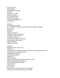
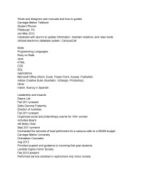
My resume went through several iterations, a few of which are shown below:

resume_sketchesResume-updated


I had a working version of my resume before this assignment was given, but I decided to redesign it completely, including updating the content. I incorporated many of the tips given by the representative from the career center, including the use of a two-column design, and not aligning dates separately.

I chose to use Adobe Garamond Pro as the font for my name and for the main headings of each section, and Univers LT Std for the remainder of the text. Garamond, a serif typeface, and Univers, a sans-serif typeface, have relatively similar x-heights, and are contrasting enough that the difference is clearly intentional.

To create space in the design, I used horizontal lines to separate  sections. I was worried that the design would look messy because the lines in the columns are not aligned with each other; but I think they are far enough apart that this does not occur.

I chose not to use bullet points at the advice of Sonjala from the career center, instead using slight (but clearly intentional) indentation where necessary.

Finally, I was at a loss at what to do with the extra space at the bottom of the left column, so I put in the logo from my business card; this added a little bit of color (I didn’t want to use any on the rest of the page because I didn’t want it to be overwhelming or to look unprofessional). The logo is in Bodoni MT.


Similarly, I created several versions of a business card:

20130326_151959business-cards-v1business-cards-v2business-cards-v3business-cards-final
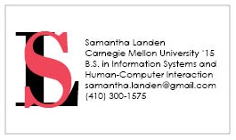
When designing my business cards, my first priority was to make all of the information easy to read and gather quickly. I ended up including a lot of text on my card, limiting what I could do with the rest of the design. Also, I did not realize at first that we could only use one color, and that the text had to be white.

In the end, I decided on a simple all-white business card, with my initials forming a log on the left third, and the text appearing on the right. I think this simple design makes the card readable and professional, while the splash of color in the “S” gives it a little personality.

Resume Content and sketches

For this class we were supposed to edit the content of our resume. I removed all formatting from my resume, added some content, and changed some header names so I would have an entirely blank slate to work with.

ResumeContent-page-0ResumeContent-page-1


Additionally, we were supposed to create thumbnail sketches of what we wanted our resume to look like. I chose to go with a fairly traditional layout, since the technical industry, while obviously very encouraging of creativity, still is most suited for a traditional approach.

resume_sketches


Final poster and button badge

For this class, we finalized our poster and button badge designs. type-hierarchy-4-poster-v2-01

For my poster, I increased the size of the main block at the top, which included the name of the typeface and the various letters. I thought there was too much white space in my previous design, which made it look empty rather that clear. Additionally, I increased the size of the year in order to make it have more importance. Finally, I increased the leading and tracking of the main block of text, so it would be more readable; since Bodoni is such a thick font, it can be difficult to read without these additions. I am not completely happy with my design; I wanted to break up the big block of text at the bottom so it would be easier to digest, but I did not get any inspiration and eventually ran out of time.


type-hierarchy-4-button-v2

My button badges I am much more satisfied with. I made minimal changes to these. In the second design, I adjusted the placement of “Bodoni,” so that the tail of the ‘Q’ directs the eye to it.

For the third design, I put the circular text into grayscale, so the design wasn’t as overpowering, and I also increased the font size of “Bodoni.”


PZ-poster-board-col-web

419498993_39a5587137_zFinally, we were supposed to create “false evidence” for our compositions – by manipulating images of poster boards and bags or shirts to put the buttons on, for example.

Poster and button badge, draft

20130307_170822
In class on Thursday, we did an exercise in which we traced the elements of our poster, identifying, the main blocks, the path the eye takes throughout the composition, the white space, and the main focus of the poster. This was helpful because it allowed me to see what was working in my poster and what was not, without having to worry about the actual text. It gave a basic visual rendition of the successes and failures of my poster.


As homework, we were to begin work on the first draft of our final project on typography – a poster using any elements of typography we chose, in addition to the ability to use grayscale on the text and background and rotation, based off one of our sketches from the previous assignment; in addition we were to create three “button badges,” small-scale representations of our typeface, in a 1.5in-diameter circle.type-hierarchy-4-poster


In my poster, I created a grayscale jumble of letters beneath the word “Bodoni,” in order to attempt to illustrate the various elements of the typeface that I discuss later in the text block. Since this is the most important element, I made it very large, with the rest of the content appearing in a smaller block below, separated from the upper half by the horizontal line intersected by the artist’s name.

type-hierarchy-4-button


For my button badges, I experimented with several ideas. In the first, I chose to emphasize the name of the typeface. I gave the name a bigger font size than in the other designs, and the only other letter I used was a “B” – the first letter of Bodoni.

In the second button, I wanted to emphasize some of the unique features about Bodoni, such as the vertical tail of the ‘Q’, the contrasting serifs on the ‘c’ and ‘C’ and the cupped serif on the ‘b.’ The name of the typeface was less important here, so I de-emphasized it by decreasing its size. I wanted the features to speak for themselves, so I made them very large but did not include the majority of the actual letter, relying instead on the viewer’s ability to use closure to determine its identity.

In the final button, I wanted to emphasize the overall look of Bodoni, so I used every letter. In retrospect, I think it is a little busy, so for further iterations I might want to play with using a light font or experimenting with grayscale.