The assignment for today was to use a given block of text about the Century font to create nine variations of a poster, according to given specifications. We had free reign over where to place the block of text on the page and how long/wide we wanted the text to be, but otherwise we had to follow rather rigid specifications. We were to create three variations on each of three sets of instructions, and for each the font had to be Century Gothic 18/25, and we were not allowed to alter the order of the text.
1. Select any two stroke weights of the typeface. Set the text in a combination of those two weights, basing your decisions on hierarchy. No linespacing or shifting the type. Only one alignment (left or right). B/W (no color).
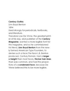
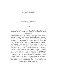
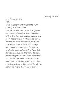
For the first variation, I used Regular and Bold fonts. I put the name of the typeface in bold, and then utilized the bold font throughout the rest of the text to emphasize important words or facts that I felt were important to understanding the information. For example, I bolded the name of the designer and important typographic qualities. I used a simple left alignment and placed the block of text on the left side of the page, approximately centered lengthwise.
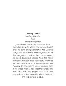
For the second variation, I used the Italic and Bold Italic fonts, using a justified center alignment, placing the block of text on the bottom center of the page. The only piece of text that I emphasized with the heavier font was the name of the typeface, in an attempt to show that all other text is only describing this essential piece of information.
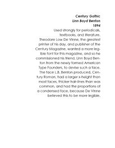
For the final variation, I used the Bold Italic and Regular fonts, placing the block of text with a right alignment on the upper right portion of the page. I emphasized the name of the typeface, the designer who created it, and the year it was first designed with the heavier font. I found that this composition did well to emphasize these parts of the information, because of the difference in font, but I felt the alignment made the body of the text more difficult to read.
2. Select one stroke weight of the typeface. Select all the type in that weight. Insert linespace (return key) between any two lines of type content, once or more than once. You may insert more than one linespace between any two lines of type. B/W (no color). Only one alignment (left or right).
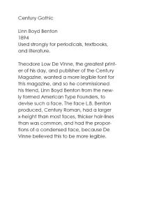
For this first composition, I used a right alignment and bold font. I used linespacing to emphasize each of the important blocks of text – the name of the typeface; the name of the designer and the year it was created; its most important use; and the paragraph of extraneous information. I placed the block of text at the bottom right of the page. I thought that in this composition the right alignment worked better than it did in the previous one, but I was still not very satisfied with it.
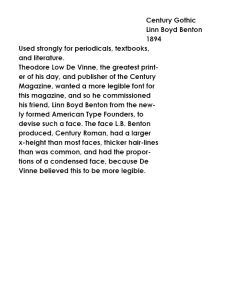
In the next composition I used a center justified alignment and italic font. I used three linespaces to emphasize the name of the typeface, and then an additional space after the name of the designer and the year it was designed. The rest of the text I felt was more supplementary info, important but not absolutely essential, so I kept it as one block.
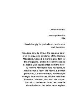
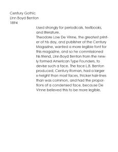
In this final composition I used a regular font and a left alignment, placing the block of text at the top left of the page. I used linespacing to separate the text into three blocks: first, the name of the typeface; second, the most important information involving who it was designed by, when, and for what media; third, the supplementary information about the typeface.
3. Select one stroke weight of the typeface. Shift lines of type horizontally left or right, resulting in only two flush-left margins. No linespacing. B/W (no color).
For the first composition, I used a regular font and arranged the basic facts about the typeface in a column on the left. The rest of the text I kept in a wide block on the right side of the page. In terms of separation of the two columns, I think this worked best, because the distinct line on the left of the large column provides a clear defining line at the split of the two segments.
I used the same structure for the next composition, but instead used a bold font and switched the sides of the blocks of text. I think this composition is much less effective than the earlier one, because it lacks the dividing line formed by the edge of the paragraph in the first composition.
For the last composition, I only separated out the name of the typeface. I used the italic font. I also made the larger block of text narrower, so that the distinction between the two blocks would be clearer. I think this goal was successful, but I think it would have worked better if I had changed the placement of the two columns, so that the name of the type face was on the left, and the larger block was on the right, once again using the dividing line formed by the edge of the paragraph to the design’s advantage.
This assignment helped me learn a lot about the effect of various typographic elements, such as line spacing and font weight. It’s clear that even the smallest change in position of text or any other element can have a large effect on what the viewer perceives as important in a composition.


 Finally, we were supposed to create “false evidence” for our compositions – by manipulating images of poster boards and bags or shirts to put the buttons on, for example.


