The assignment due this week was our final versions of our Gestalt pieces, mounted together on a black board. I made a few changes to my pieces before finalization, some drastic, some minor. To arrange the pieces on the mounting board, I tried to create a balance between the heaviness of the designs. Tension, because it has the most white space, I put in the middle. To either side of it I placed order and comfort, which have less white space but are both very structured and confined to about the middle of the page. At either end I placed congestion and playfulness, which were the heaviest of all of the designs.

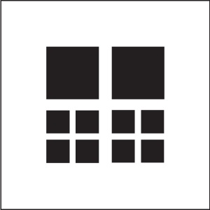
ORDER
When receiving feedback from Somya on my pieces, for many of my pieces she challenged me to use fewer squares. I put this into practice in my order composition by removing the bottom group of squares, and I think it turned out very well. I took issue all along by the way the smallest squares seemed too close together, and I think the composition looks better without them. The new composition forms a square, which adds another dimension of order with the way it fits into the containing white box itself.
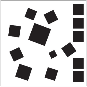
PLAYFULNESS
 For the most part, this design remained unchanged from the previous version. I removed only one square. Again, Somya challenged me to use fewer squares, but I found that whenever I attempted to manipulate the design, I lost the feeling of playfulness to a large extent. I tried several variations using fewer squares, but was unable to find one which I felt exemplified playfulness as much as this composition.
COMFORT
With this design I made one of my most drastic changes. Throughout the design process, I struggled to have my composition display comfort. Somya commented that in my prior versions of the design, the eye jumps between the figure and the ground. To change this, I kept some elements of my original design, but manipulated them in a way so as to change them into something new. In this design, which I think is more comfortable to view, I created the idea of smaller blocks cradling a larger one.
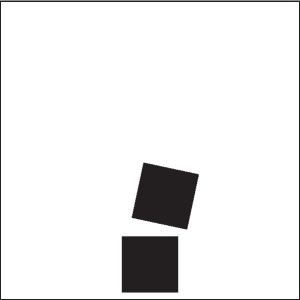
TENSION
 With this design, I took Somya’s advice of trying to display the same thing with less squares. In addition, I tried again to fix the problem I had been having that, due to the extreme angles of the blocks, the design tended to evoke playfulness rather than tension. With this design, I kept the same idea, but leveled out the bottom block, and created a distance between it and the top block, which looks as though it is about to fall on the bottom block. The angle of this block creates an uncertainty in the design about where the motion is going to go next, creating tension.
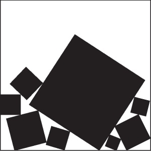
CONGESTION
I made very minor changes to this design. I removed many of the smaller blocks, which I found reduced the clutter of the design without confusing or decreasing the value of the emotion conveyed. In addition, I increased the size of the larger block to about the same size as it was in my original design. I find that this contrast, along with the contrast of the clutter in the bottom with the white space at the top of the design, conveys congestion very well.


